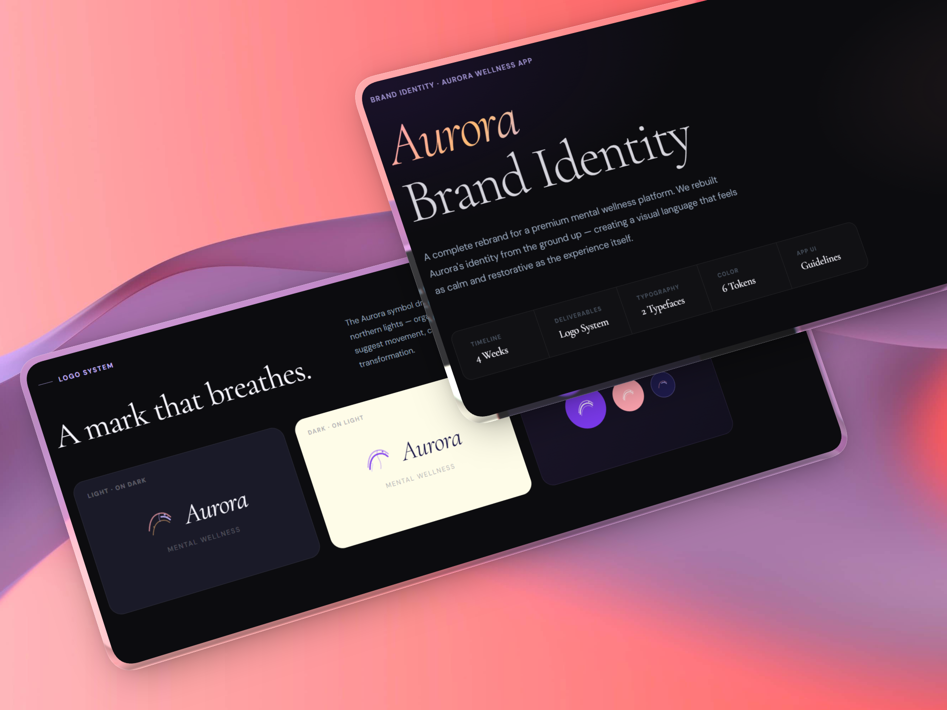
Aurora Brand Identity
A complete rebrand for a premium mental wellness platform. We rebuilt Aurora's identity from the ground up — creating a visual language that feels as calm and restorative as the experience itself.
The Challenge
Aurora was building a premium mental wellness platform but their brand felt generic and cold — the opposite of what their product stood for. They needed an identity that communicated calm, warmth, and transformation from the very first impression.
The brief was clear: create a visual language that feels as restorative as the experience itself. Every colour, typeface, and mark had to carry emotional weight.
Our Approach
We built the identity around a single idea: calm is a practice, not a destination. Every design decision flowed from that.
Brand Strategy
Defined positioning, tone of voice, and the emotional territory Aurora needed to own in the mental wellness space.
Visual Identity
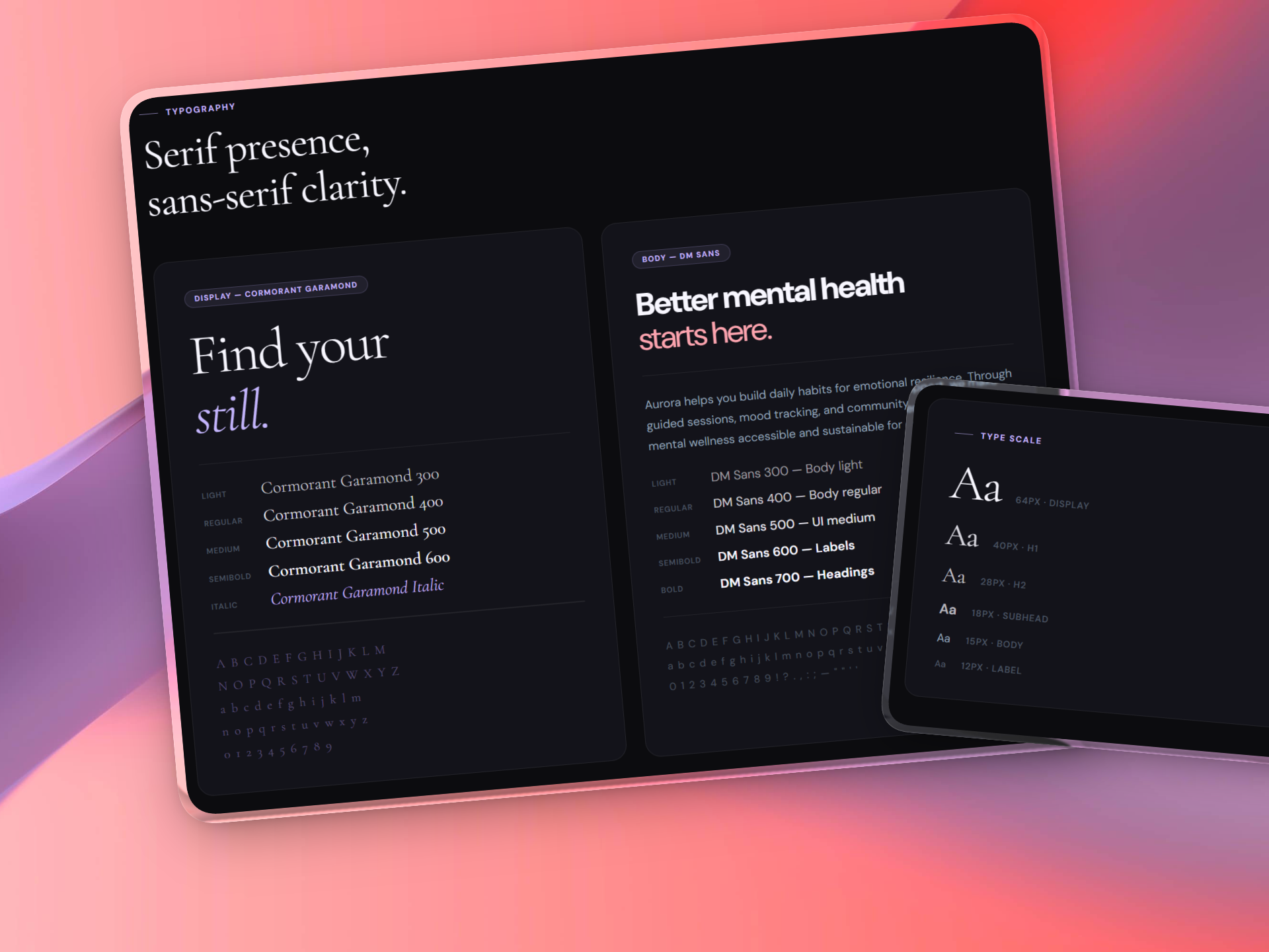
Designed the Aurora symbol — organic, flowing arcs drawn from the northern lights — paired with Cormorant Garamond for presence and DM Sans for clarity.
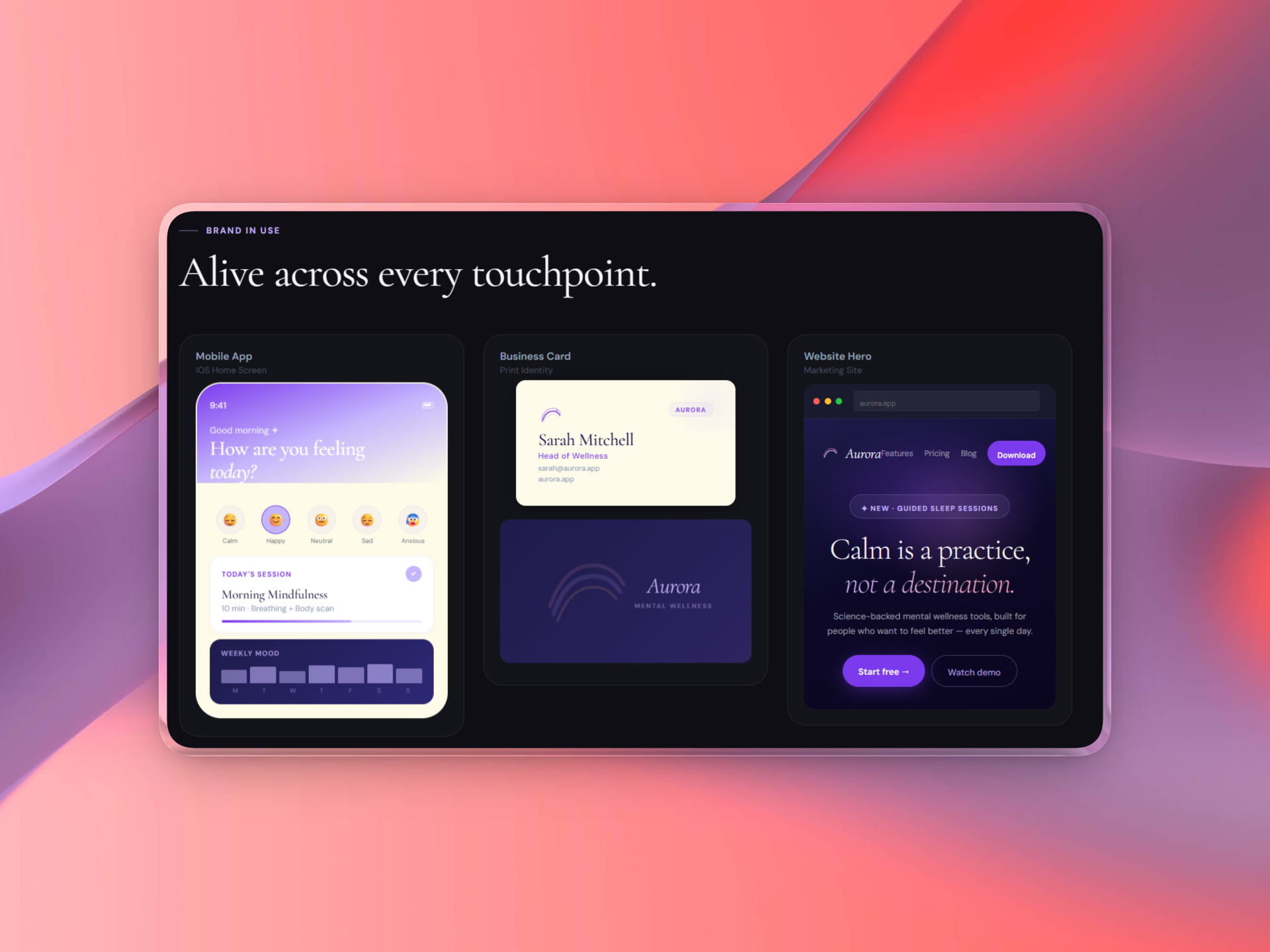
System & Rollout
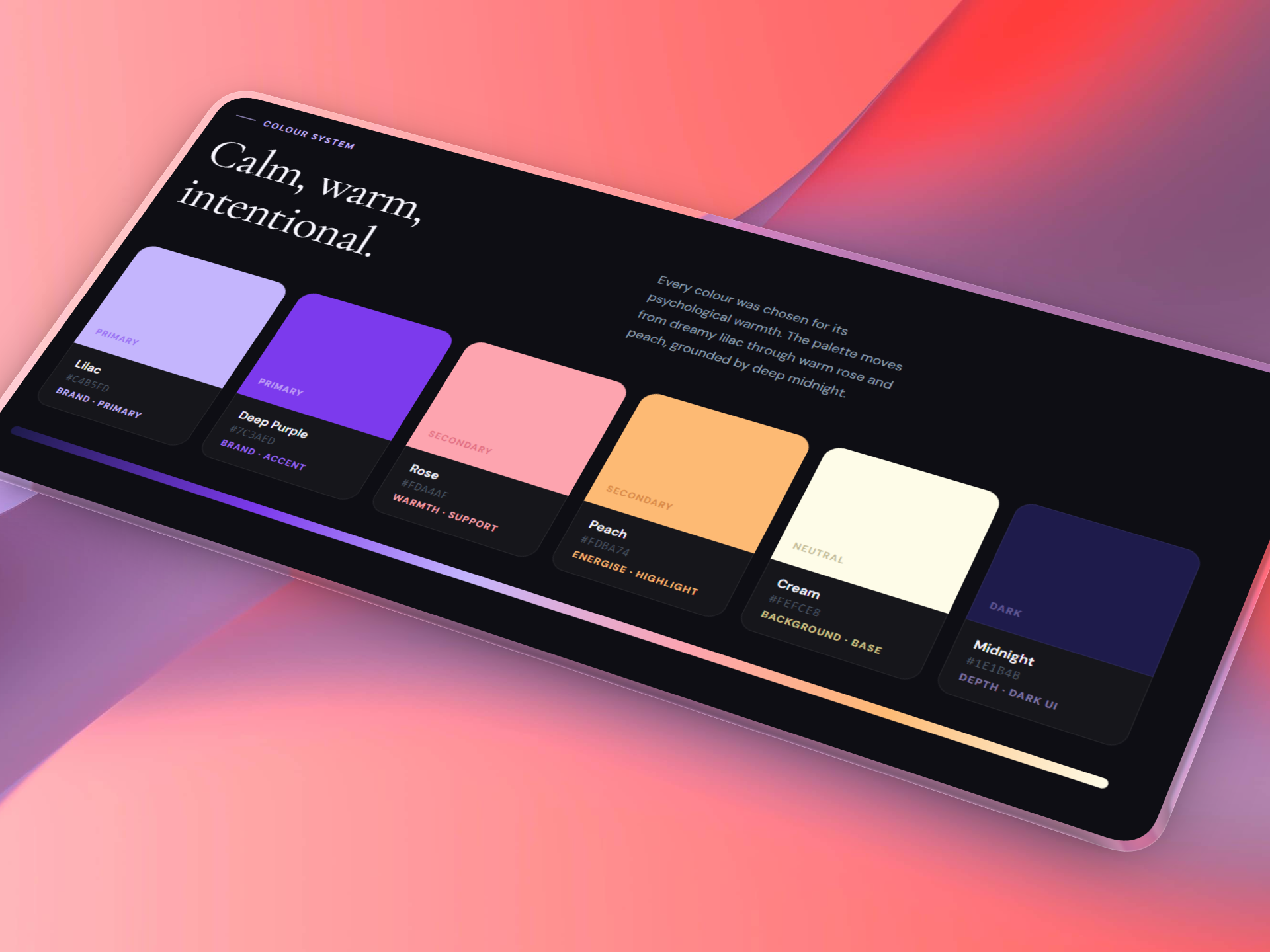
Built a complete colour system (Lilac, Deep Purple, Rose, Peach, Cream, Midnight) and delivered full brand guidelines, app UI tokens, and all assets.
The Results
4
Weeks Delivered
6
Colour Tokens
2
Typefaces
✓
Full Guidelines
Tech Stack
The identity Growlio created for Aurora feels alive. It's calm, premium, and unmistakably ours. Every touchpoint now feels intentional.
Lisa M.
CMO, Aurora